
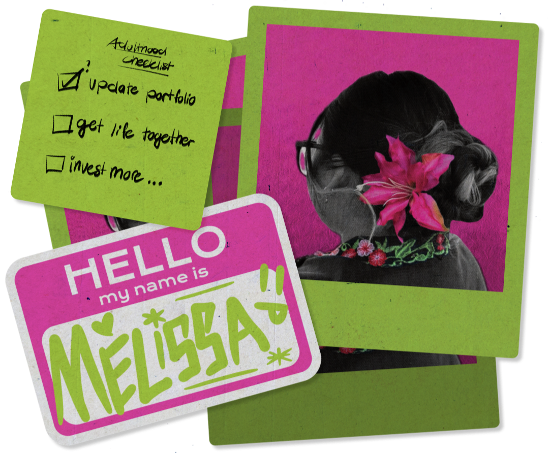
oh hi, im mel :D!
a freshgrad who speicalized in ui/ux that is quite multidisplinary, a jack of all trades as they would say!
web design & landing pages
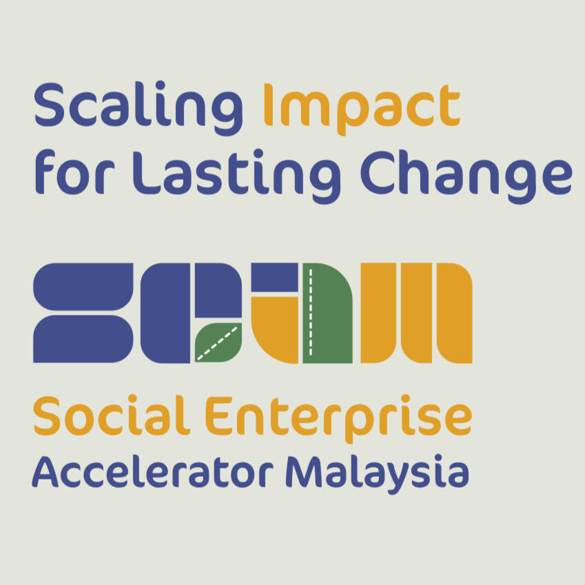
Social Enterprise Accelerator Malaysia
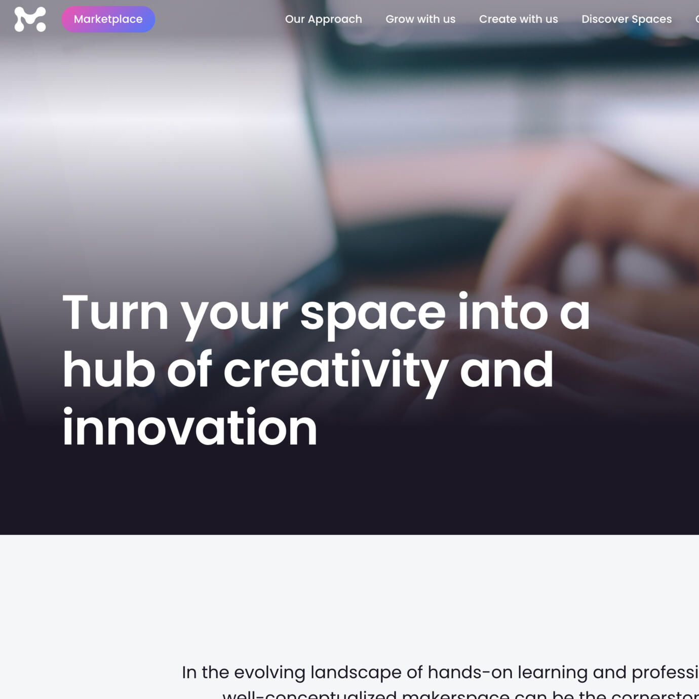
Makerspace
@ Mereka
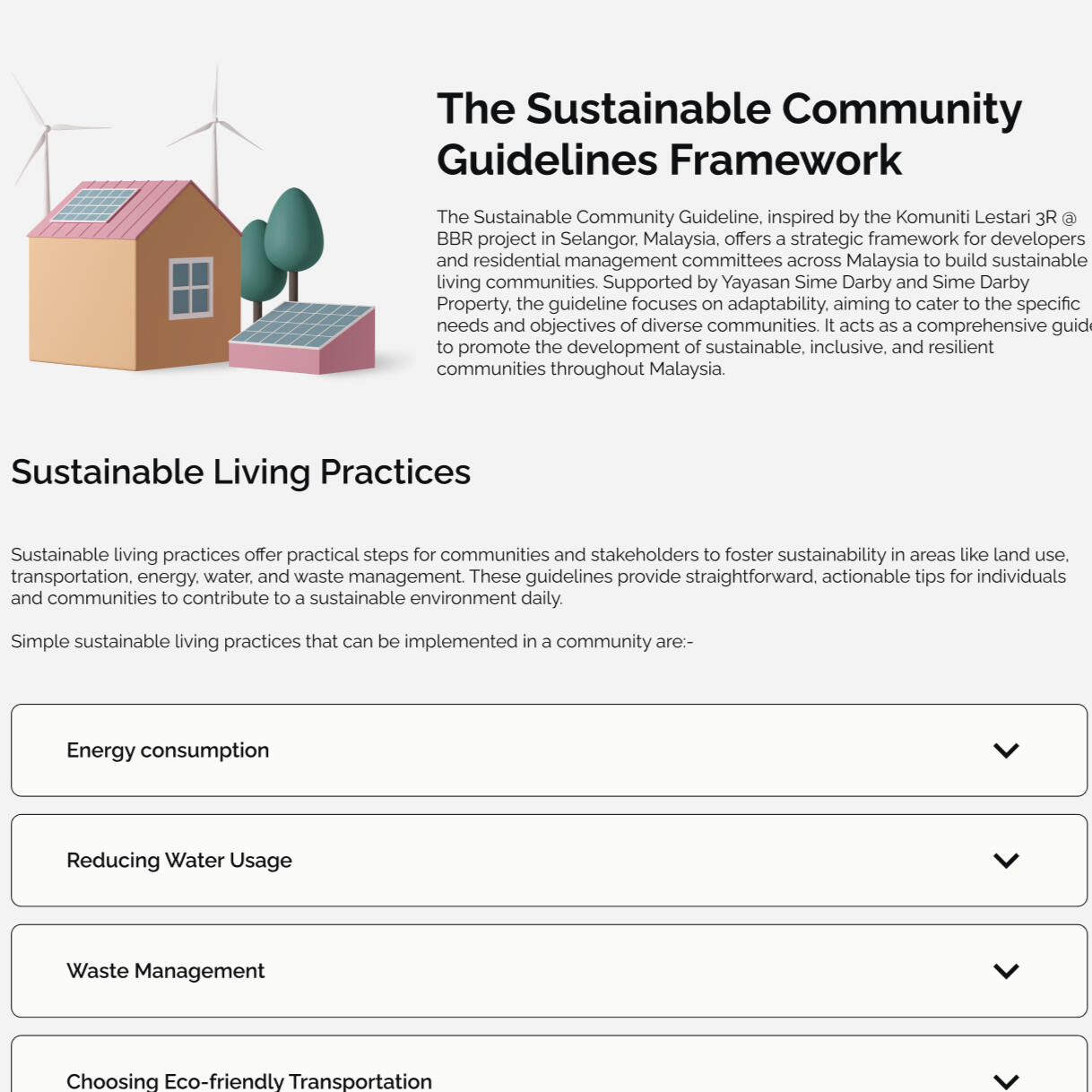
Sustainable Community Guidelines
product design
TigaLima
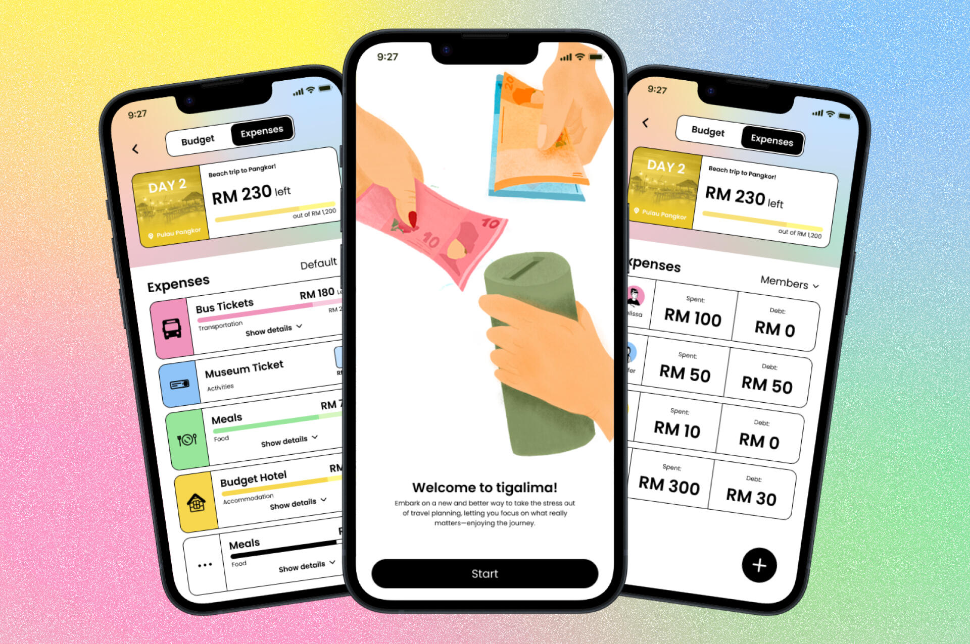
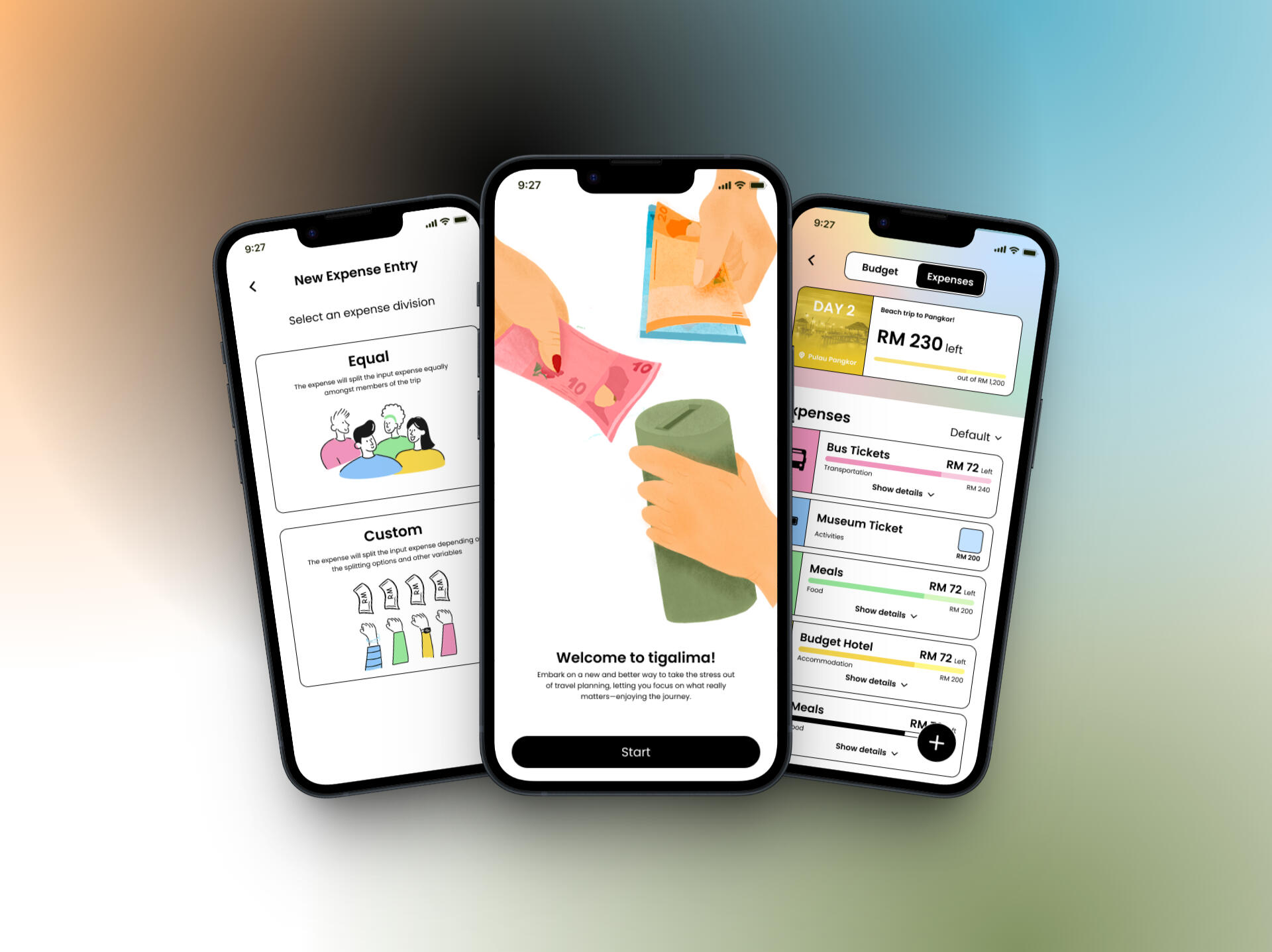
A budget and expense tracking app designed specifically for group travelers with a focus on group transparency and usability.
other design projects
Cup Sleeve Event Microsite
A microsite for a cup sleeve event for Kim Ryeowook in Kuala Lumpur organised by RyeongguMY & E.L.F Kingdom Malaysia.
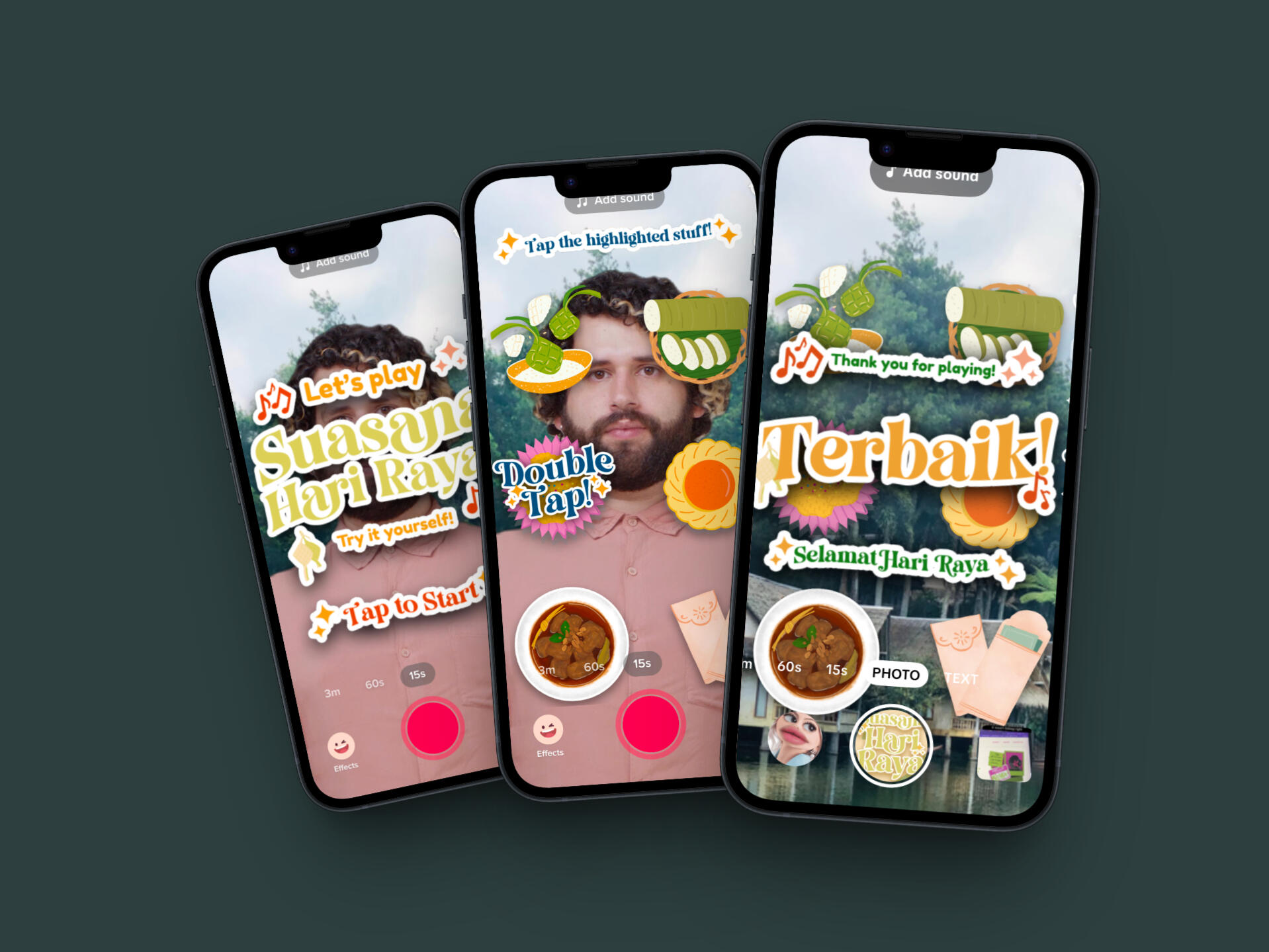
#InspirasiRaya Gamified TikTok Filter
A TikTok Gamified Filter that was created for Tiktok Malaysia's University Effect House Campaign. Winner for Engaging Game's Category.
Thank you for scrolling till the end <3

drop a hello!
don't be shy!
Thank you for scrolling till the end <3

TigaLima
Overview
TigaLima is a budget and expense tracking app designed specifically for group travelers. It simplifies managing finances on the go, making it easier for budget-conscious groups to split costs, track shared expenses, and stay on top of their travel budget. TigaLima is your companion for stress-free financial management during group adventures.
Background
This project was pitched as my final year project at university. The idea came from a group trip to Pangkor Island in 2023 with four of us. As the planner and person in charge of finances, I struggled to manage both the group’s budget and my own expenses at the same time. I realised there wasn’t an app on the App Store that could combine budgeting, expense tracking, and clear visualisation all in one place — which sparked the inspiration for this project.
What
A mobile app concept, designed to help travelers manage group and individual expenses in one place, simultaneously.
Why
Most apps only track expenses for individuals, showing how much has been spent but not how much remains in the budget. This lack of transparency made it challenging to manage group finances effectively and keep everyone aligned.
Outcome
I designed the app concept with user flows, wireframes, and visual mockups that integrated group budgeting, expense tracking, and financial visualisation. The outcome highlighted how these features could simplify financial planning for group travel, making money management more transparent, efficient, and stress-free.
Key Features
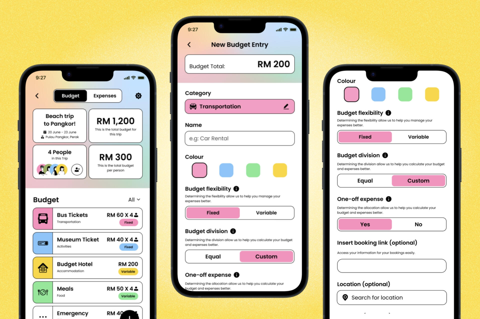
Budget Pre-planning
Create pre-planned budgets to simplify expense management during trips, incorporating key features such as budget flexibility, budget division, and one-off expense.
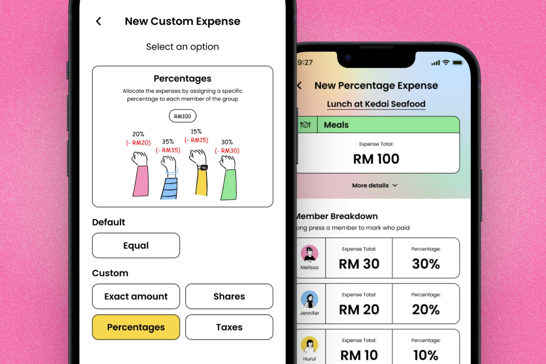
Division options
Expenses to be divided among members with ease and accuracy, offering multiple division methods to accommodate different preferences and group arrangements.
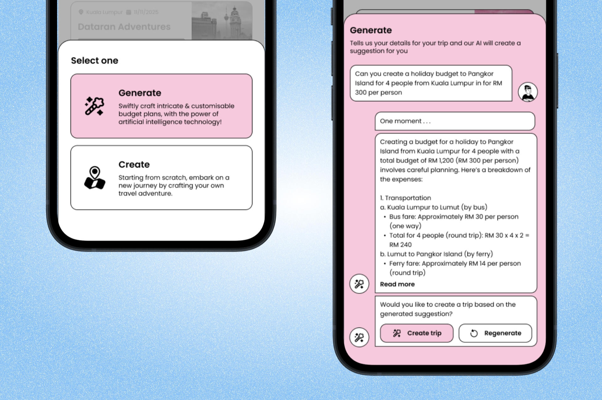
Generate trips
With the support of Generative AI, users can effortlessly create trip plans, even when unsure of how much to budget for their journey.
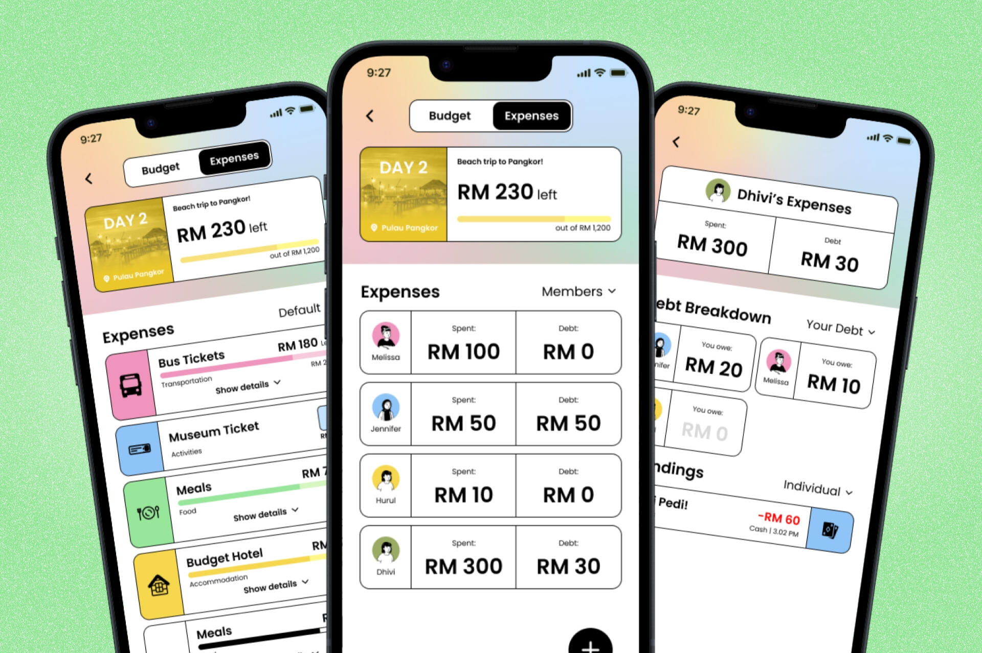
Visual presentation
Multiple ways to visualise expenses, making it easy to track individual contributions, determine outstanding balances, and maintain clarity and transparency among all members.
Reflection
This was my final year project, and I had a lot of fun planning and designing it, as the concept was very close to my heart. Looking back, there are a few things I would have done differently, such as minimizing the use of secondary colours. However, this was part of the original idea, as the design was intended to reflect a more dynamic colour scheme. Additionally, the font size variations could have been more consistent.I would also like to highlight that my internship experience played a crucial role in shaping my skills, marking a significant improvement compared to my earlier student projects. Overall, I am very proud of the outcome, and I hope this concept can one day be developed further into a fully-fledged application.
Thank you for scrolling till the end <3

#InspirasiRaya Gamified TikTok Filter

Overview
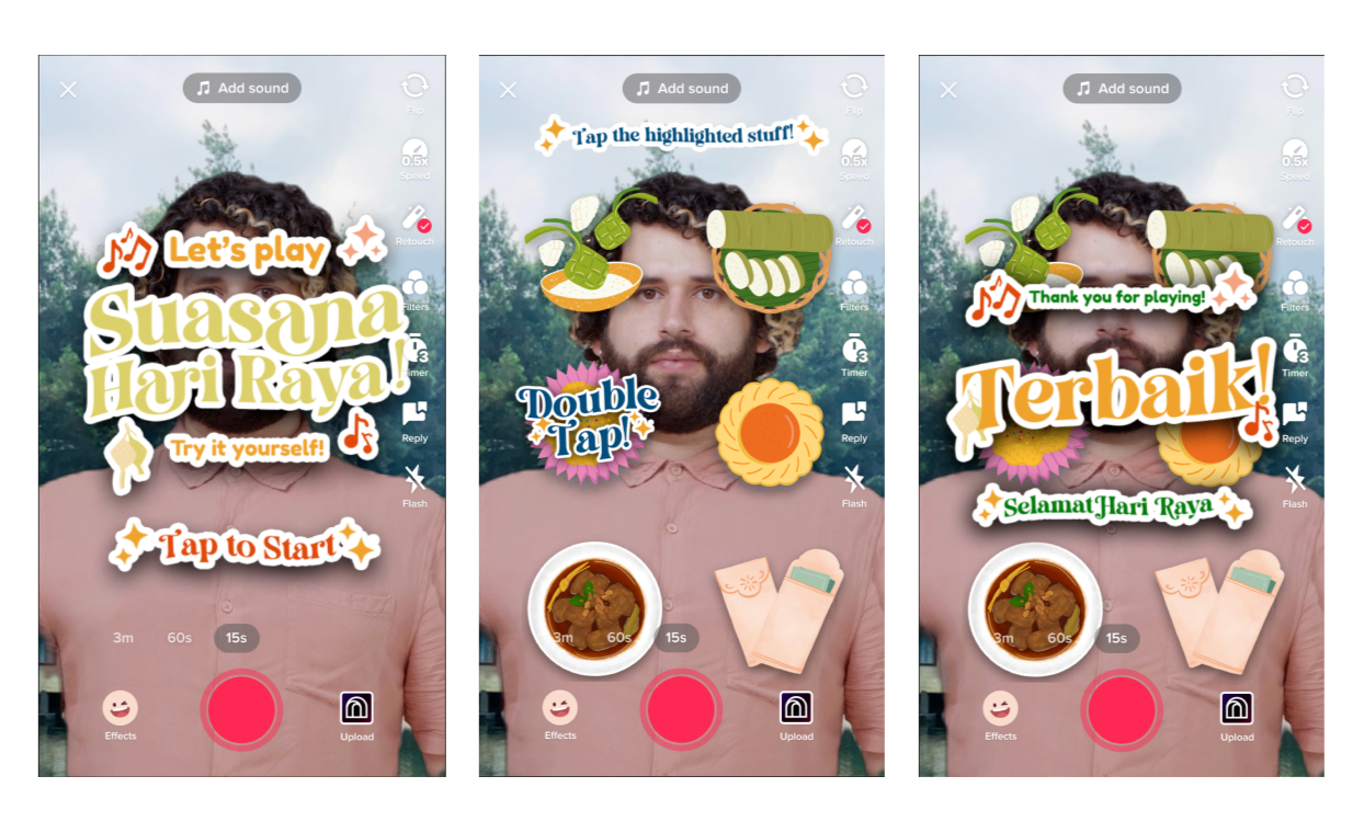
The goal of the project was to create a TikTok filter & the final product was submitted in TikTok Malaysia’s University Effect House Campaign. In the spirit of Eid, the filter is "raya" theme and follows the #InspirasiRaya trend. Out of the 4 categories, this project won for the ‘Engaging Games’ category. This project was the first assignment for my Advanced Interactive Design module.
Filter Gameplay

Filter Gameplay
Ideation
I started the process by brainstorming and researching about TikTok filters that were available at the time. In the spirit of Hari Raya Aidilfitiri, I decided on making a Hari Raya-themed filter, that rules down the aesthetic of the filter later on. There were 4 categories of the University Effect House Campaign, and I decided to focus my process on the 'Engaging Games' category.I spent a few days going through Effect House creators in TikTok and how they come up with ideas for their filters. We had the chance to attend a talk by gameplus40, where he guided us on where and how should we start with filter Ideas.One of the happiest parts of Hari Raya to me was always the songs and music we got to enjoy as the festive season went on. Inspired by funny videos of people using a soundboard filter for their videos, I proposed a filter where people can play Hari Raya music in the filter, but make it gamified. As a person who has zero experience in music I decided to go with the sounds of a piano for the project so I searched piano-related TikToks too to understand the designs and mechanisms that I can apply for my filter.
Soundboard & Piano TikTok Video Example
(credits to @itsaubreyxo & @kiddquxn)
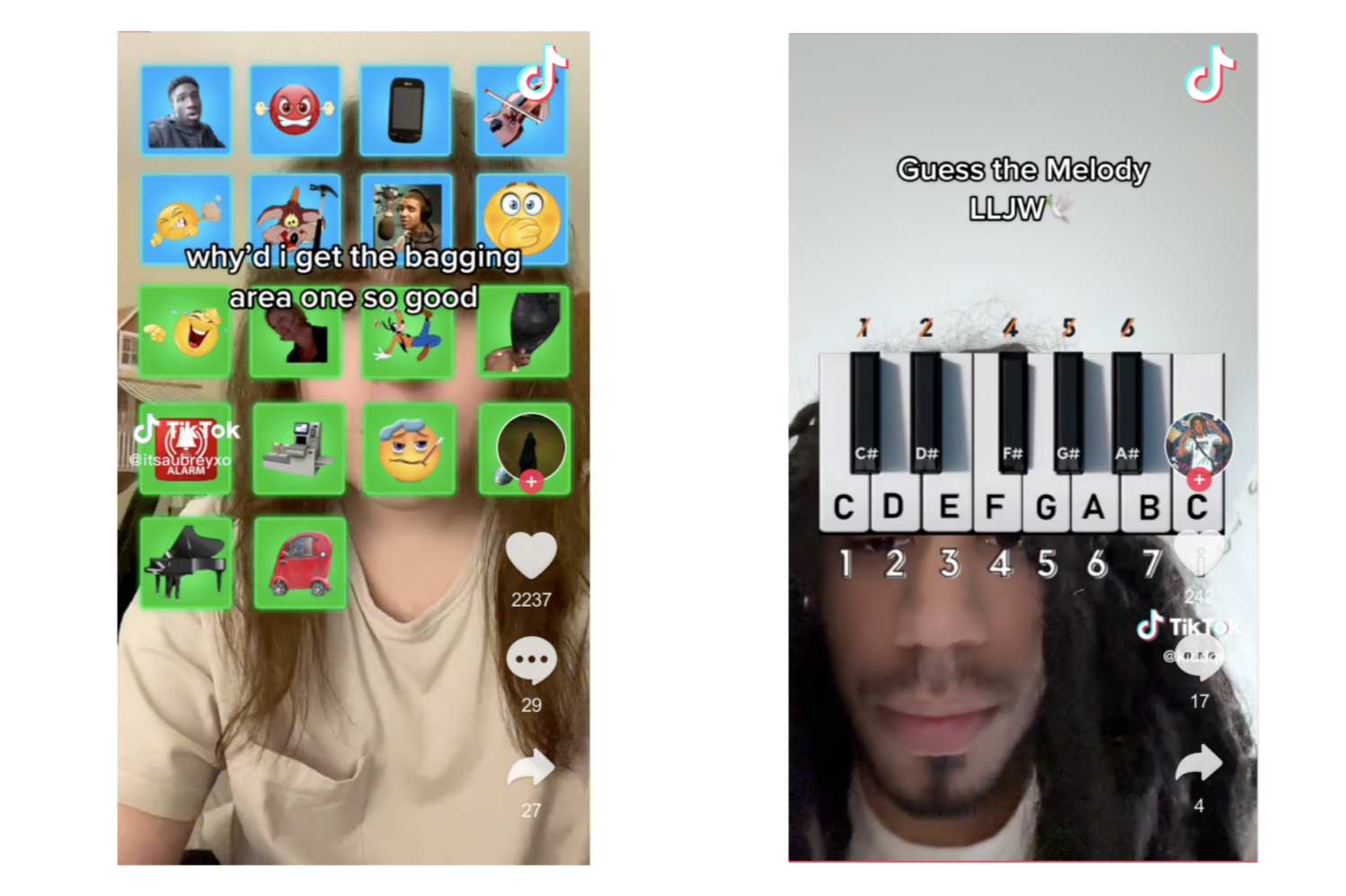
After my self research on potential ways I can make these types of filters gamified, I started sketching out ideas for my filter. When I was sketching, I had to take some things into consideration such as the limited space that is available & not to make the filter too heavy as the maximum capacity is 5MB. As my skills for Effect House was quite limited during the initial stages of this project, I had to figure out the mechanisms of the the filter first and continued my designing stage afterward.The basics of the filter mechanism is that the users will be guided to tap a "button" it will make a sound, which will be a piano note, and it will continue like a step by step guide.
Design Process
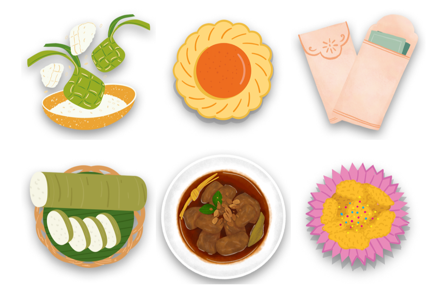
I started the mechanism part of my project by finding tutorials on how to make soundboards on Effect House. Afterwards, I started planning the musical part of the project with the help of my partner. My partner created a simplified version of the song "Suasana Hari Raya" by Anuar Zain & Ellina, which is an iconic song for Eid in Malaysia. He was able to reduce the song to only 6 notes and I finalised my sketch with 6 buttons for my gamified filter. 6 Buttons will appear on the screen and each of them will play a different note.I found assets online and each button of the filter is Hari Raya themed, such as different type of kuih & traditional food and items such as money packets. I also applied an Image of a Kampung for the background of the filter.
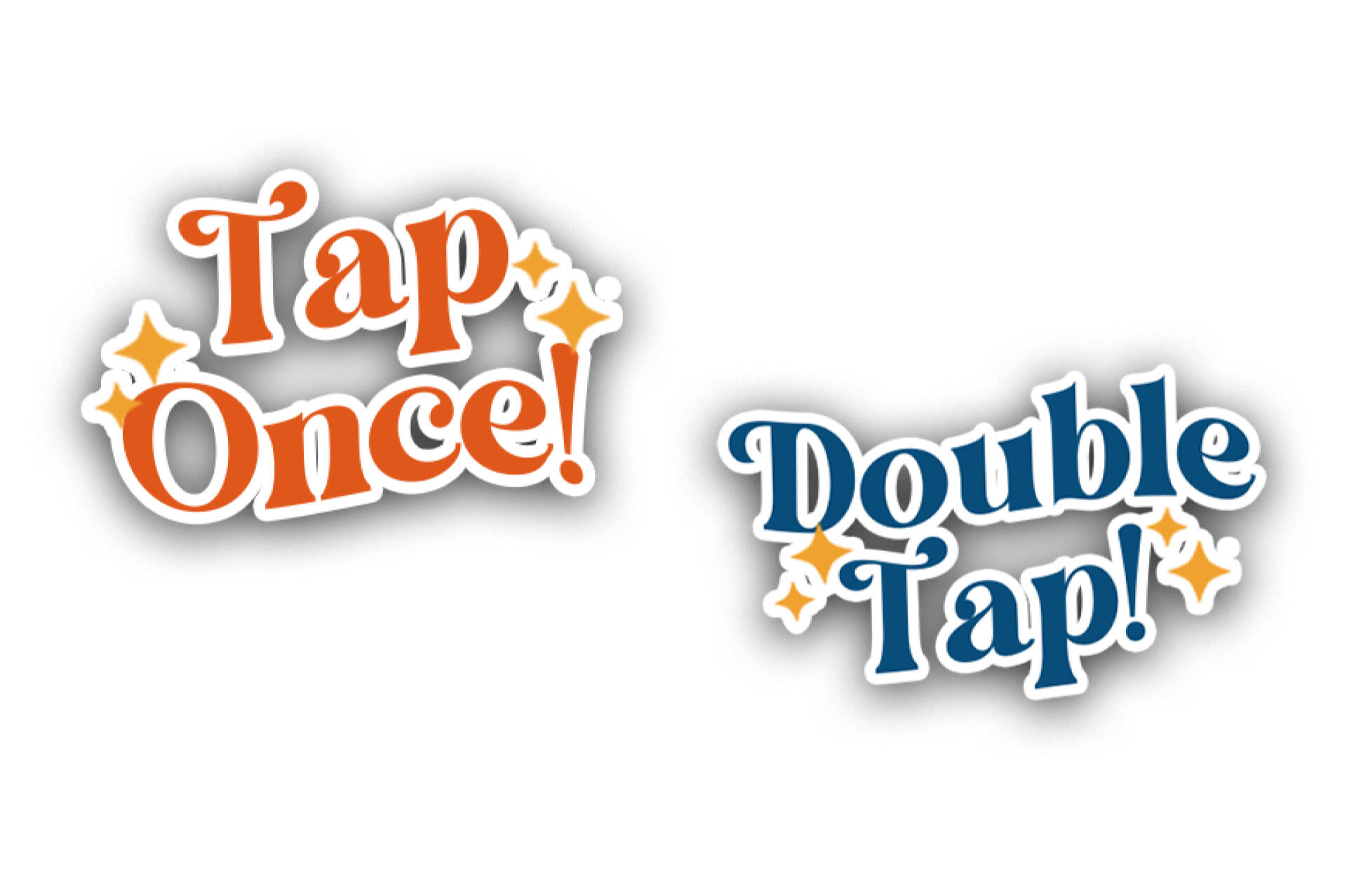
Initially, I planned to created a 'Tap' visual on the button that moves from step to step. However, when I learned to play the song on the piano, A key had to be played more rapidly compared to the other keys. Meaning a singular Tap did not make sense for the mechanism, to overcome this, instead of only it being 'Tap', I created 'Tap Once' and 'Double Tap' Buttons instead. 'Double Tap' allowed for the users to tap the note faster instead of putting a singular Tap ,twice, on a key.
When arranged in Effect House, I had to make the buttons smaller than intended due to TikTok's UI and to created more white space. Furthermore, I added 'Tap the highlighted stuff' on top to easen users.I also created a Start Page that when a user tap on the screen the game starts & when the last button is clicked, a 'Thank You' page appears too.
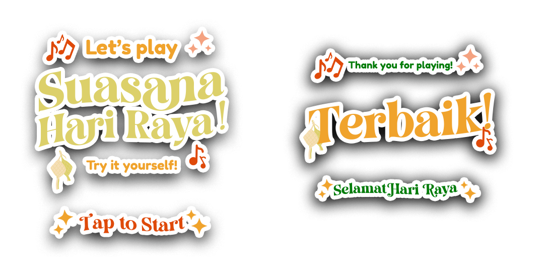
When arranged in Effect House, I had to make the buttons smaller than intended due to TikTok's UI and to created more white space. Furthermore, I added 'Tap the highlighted stuff' on top to easen users.I also created a Start Page that when a user tap on the screen the game starts & when the last button is clicked, a 'Thank You' page appears too.
Reflection
When the the filter was completed, I had multiple people test it and one issue that I did not consider is when you double tap the screen, the front camera change to the back camera vice versa. It does not effect the filter per se but it does effect the recording part of it but it is generally was not a big issue.This project let me learn a whole new software that has always been in my bucket-list to learn. Throigh this project I was able to develop my development skill eventhough it was quite minor, it has opened my interest for programming. This project also made me understand some additional things when it comes to user experience. For example, the animation when the buttons are tapped became an indicator to the viewer's prespective, without the animation, the viewer of the video won't know which button the user tapped.Furthermore, this project has helped me experience being the programming side of a project rather than just the front-end as a designer. This opened to me being able to think a different or more practical way when designing. I hope I would be able develop more skills for effect house in the future.
Thank you for scrolling till the end <3

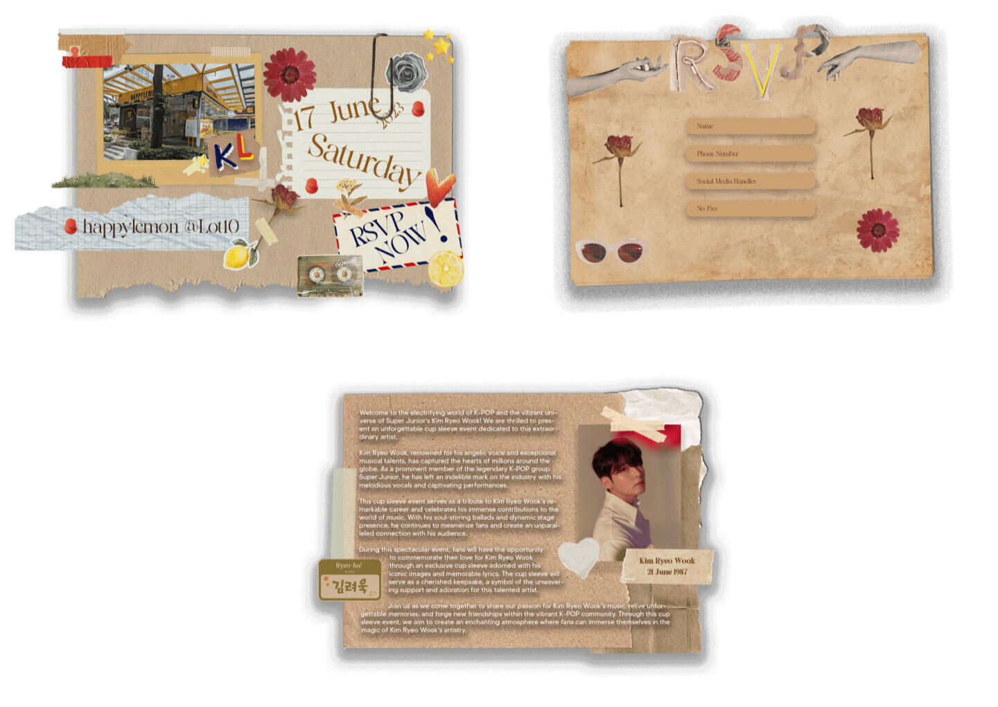
Cup Sleeve Event Microsite

Overview
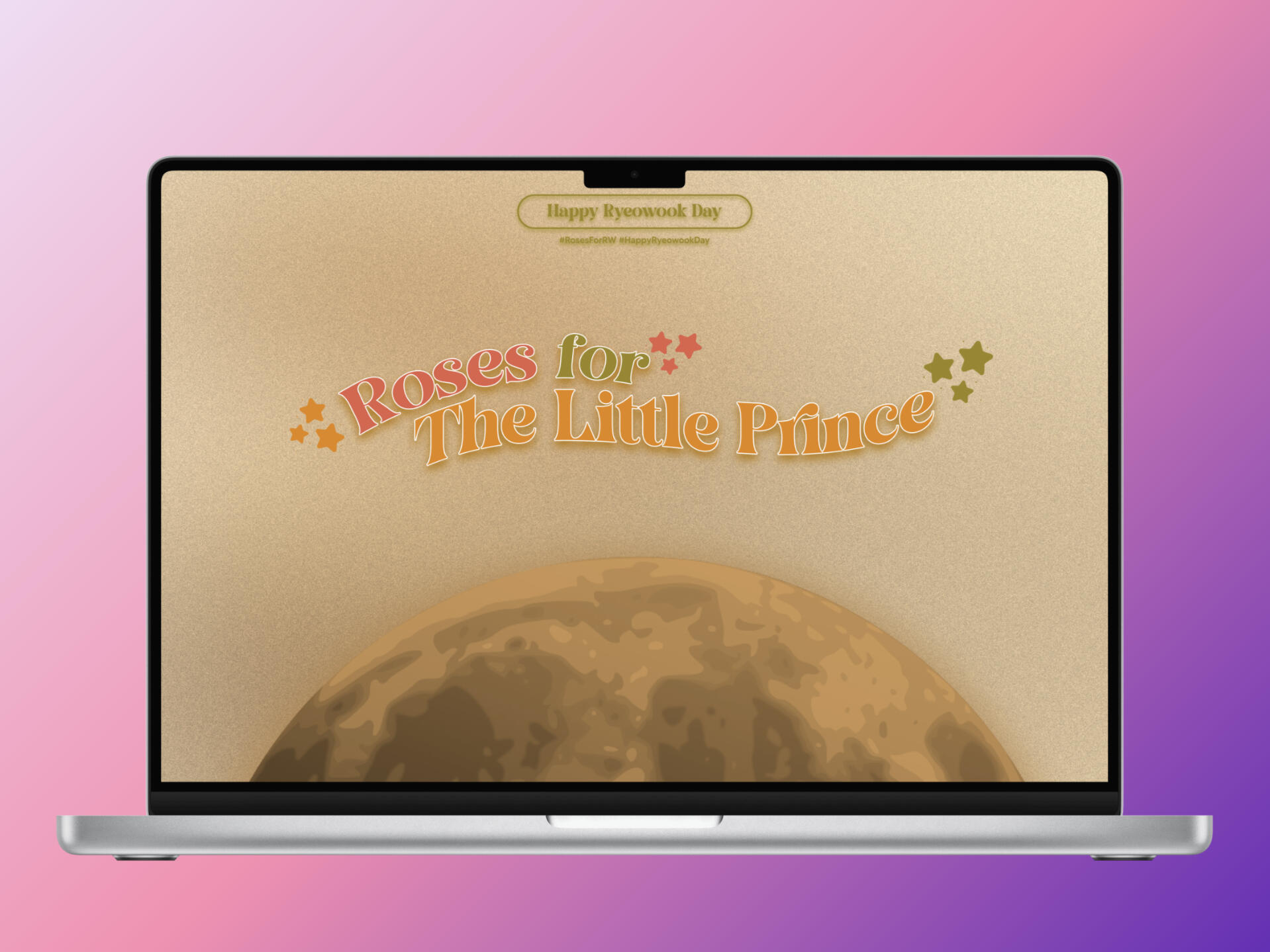
A microsite for a cup sleeve event for Kim Ryeowook in Kuala Lumpur organised by RyeongguMY & E.L.F Kingdom Malaysia.
Microsite Overview
The goal of the project was to create a microsite using mainly Adobe Animate CC for the animation portion. I created a microsite for a cup sleeve event for Super Junior's Kim Ryeowook in Kuala Lumpur organised by RyeongguMY & E.L.F Kingdom Malaysia for the project. The keyart and art direction were given by my client.
Design Process
The event theme is based on two of Kim Ryeowook's songs which are The Little Prince and The Wild Rose. It is worth mentioning that the aesthetic of The Little Prince is based on the classic book The Little Prince by Antoine de Saint-Exupéry.. Thus there is a book-styled theme and art direction for the project. I went with a non-conventional (by today's standards at least) approach to the design of the layout. There is a total of 4 main pages:-
1. Home Page
2. About Page
3. Location Page
4. RSVP PageAdditional Pages added after the initial design stage:-
1. Landing Page
2. Pop-out Thank You Card Page
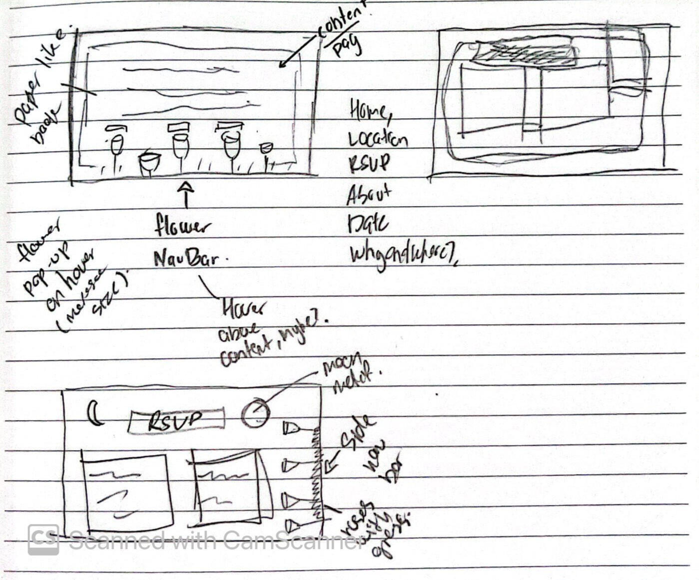
I wanted the NavBar to be a garden of roses of some sort and the pages will slide through by clicking the buttons on the nav bar. As we had limited time on this project I tried to keep it as simple as possible.After designing the first 4 pages that I listed above, I added 1 more additional page which is the Landing Page when you open the microsite, which also acts almost like a loading page. Furthermore, the RSVP Page is a page that has a form, hence, I decided to create a pop-out thank you card when users click submit, making it 6 total pages overall.
Page Design
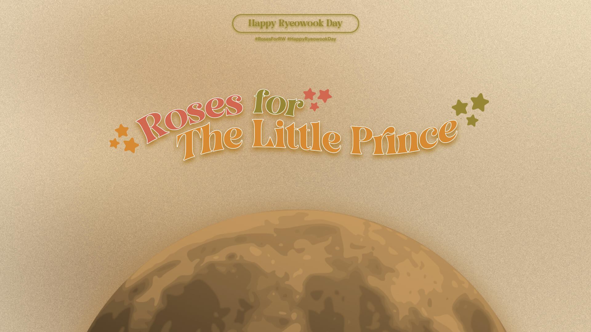
Loading Page
The moon will come out from the bottom alongside the "Happy Ryeowook Day" emblem coming from the top, then the Roses for The Little Prince slides up behind the moon once the moon completes.
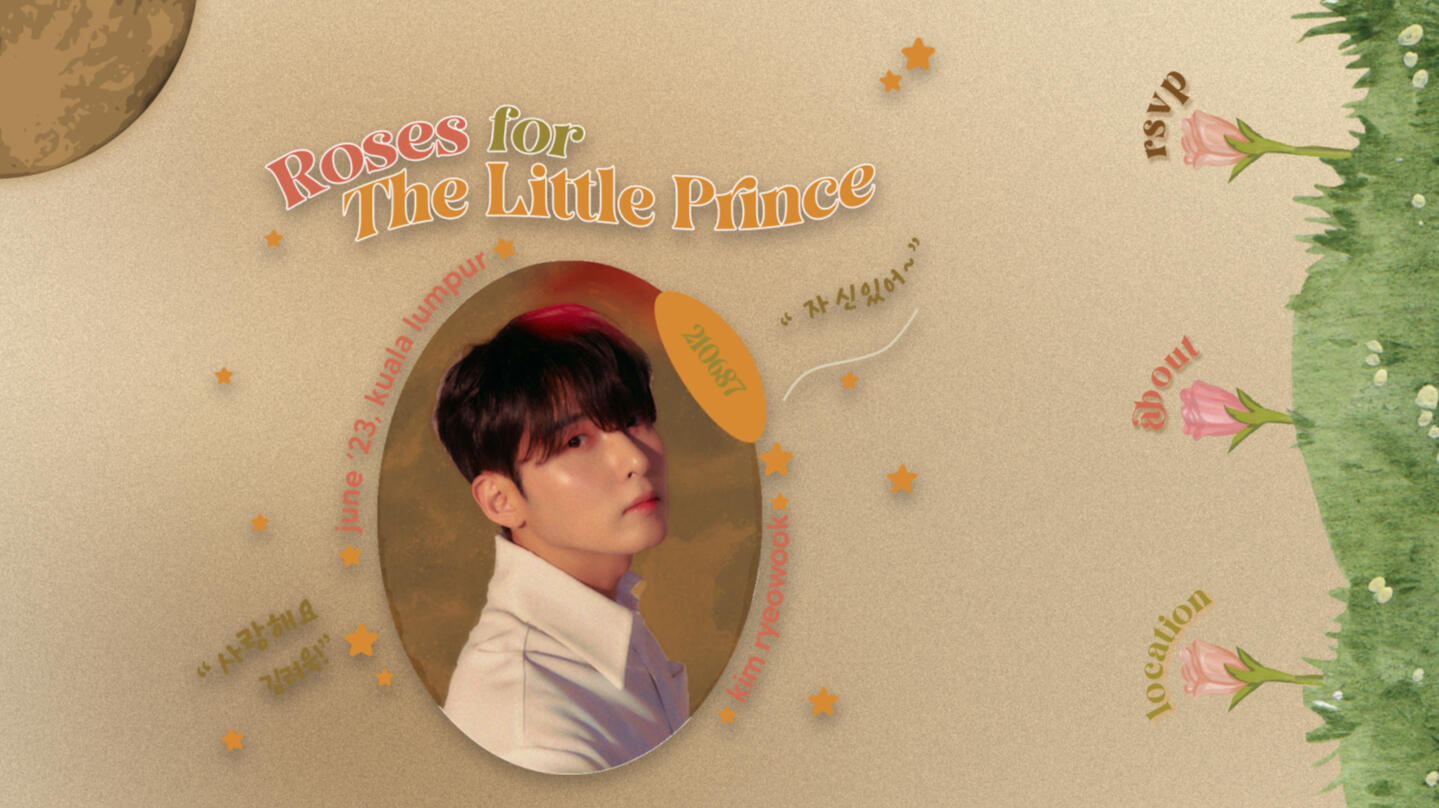
Home Page
Loads after the landing page slides out, the Rose NavBar will come out first with each flower coming out one by one, then the Keyart slides in with the moon in the corner and (The moon spins too)
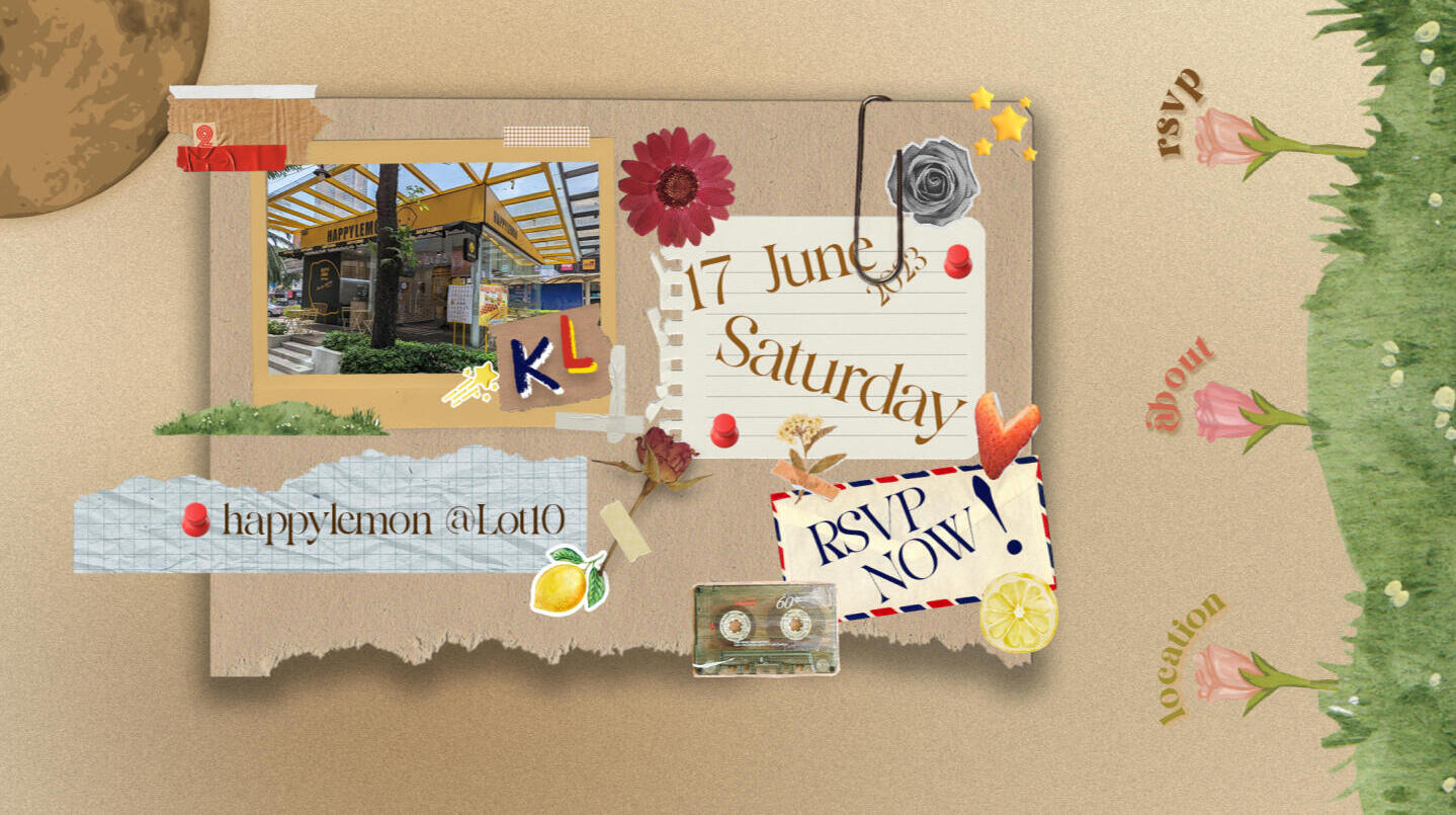
Location Page
The page slides in when the Location button is clicked on the NavBar
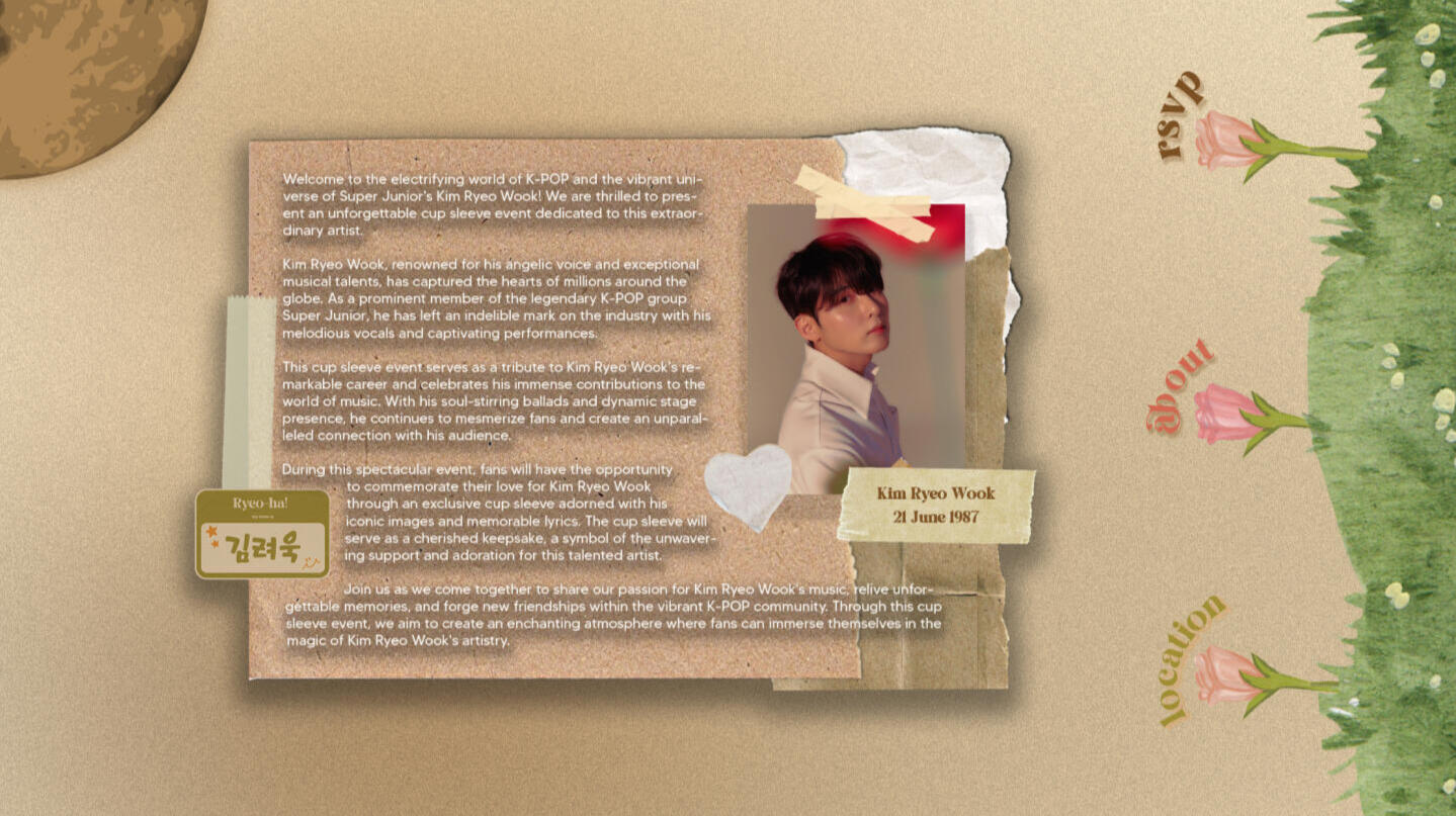
About Page
The page slides in when the About button is clicked on the NavBar
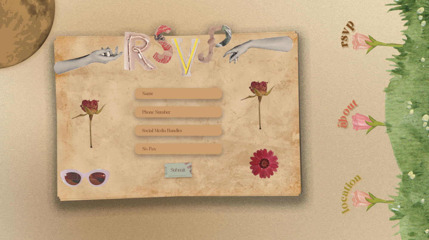
RSVP Page
The page slides in when the RSVP button is clicked on the NavBar
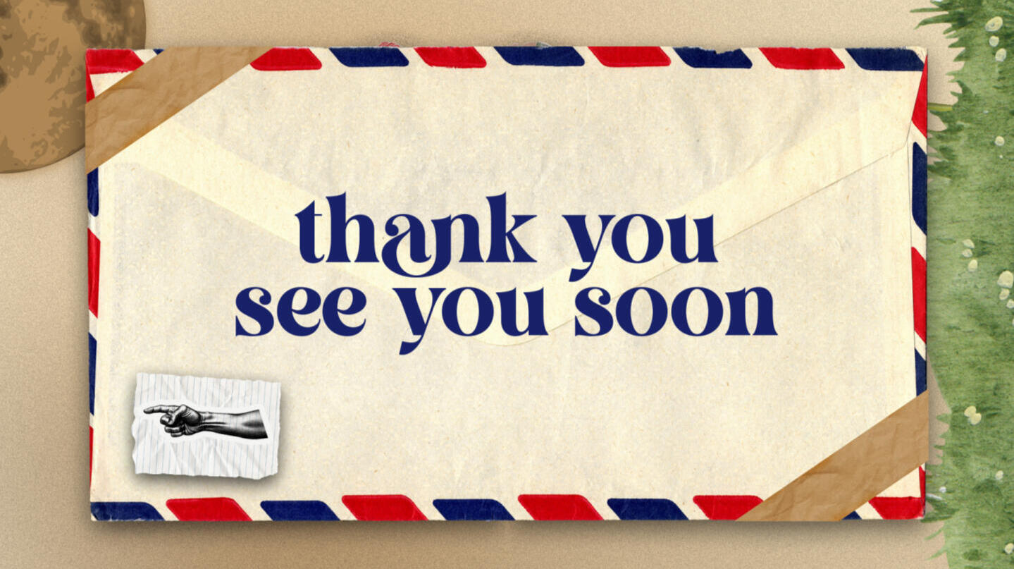
Thank You Page
This "page" is a pop-out card when the submit button is clicked on the RSVP page after the form. The Arm acts as a back button and the card will slide out and back to the RSVP page.
Building The Microsite
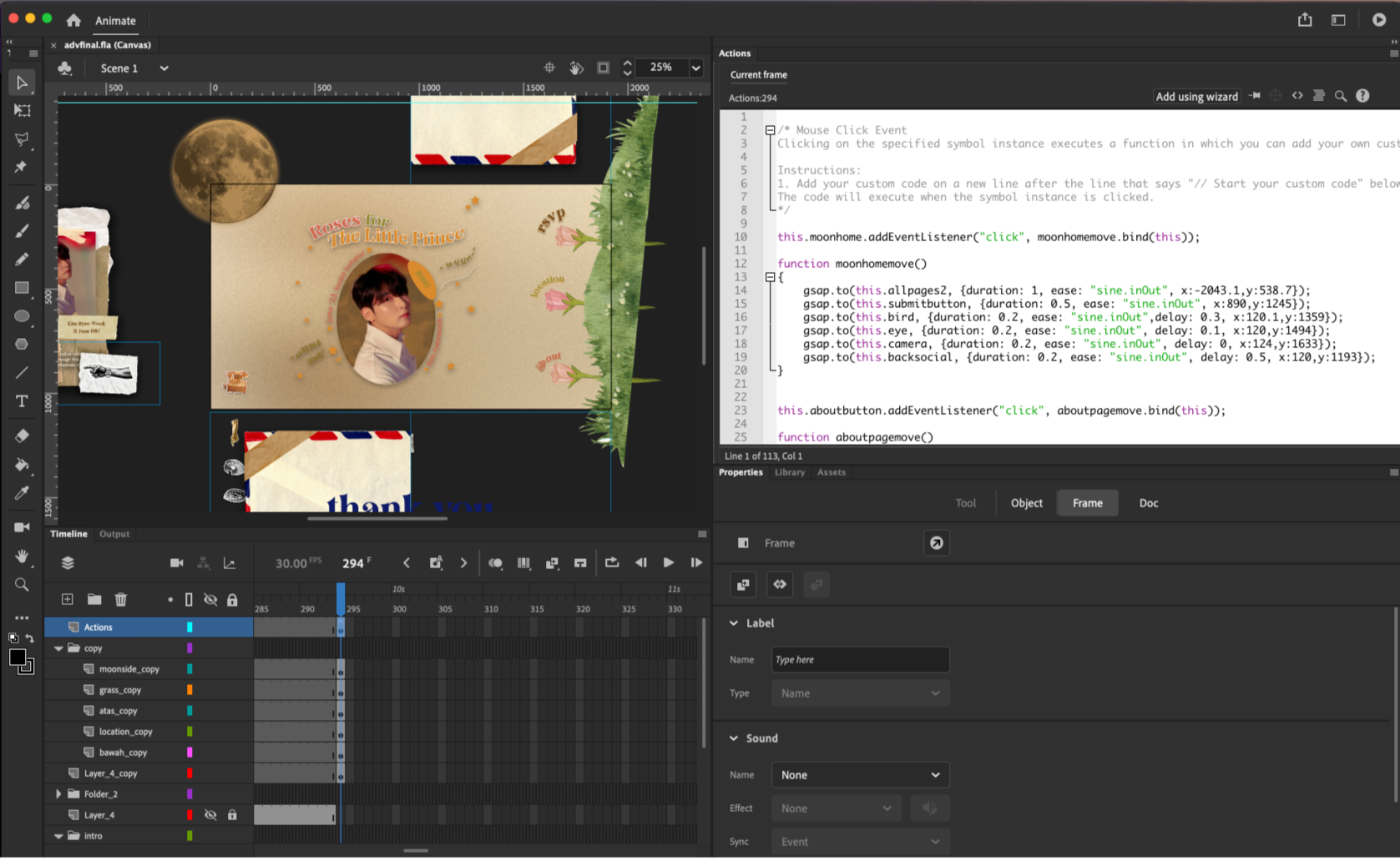
Screenshot of Adobe Animate CC
We were required to use Adobe Animate CC for this project with the help of GSAP, a Javascript Framework for the animations. It was a challenge as we had to use keyframes instead of the traditional coding HTML & CSS but you would do a lot more interesting motions a lot easier with Adobe Animate CC. I deployed my site on Netlify but the loading is quite slow due to the designs being big in size.
Design of each main page in one layer, The microsite has a static background and these "cards" act as the pages when it slide in and out
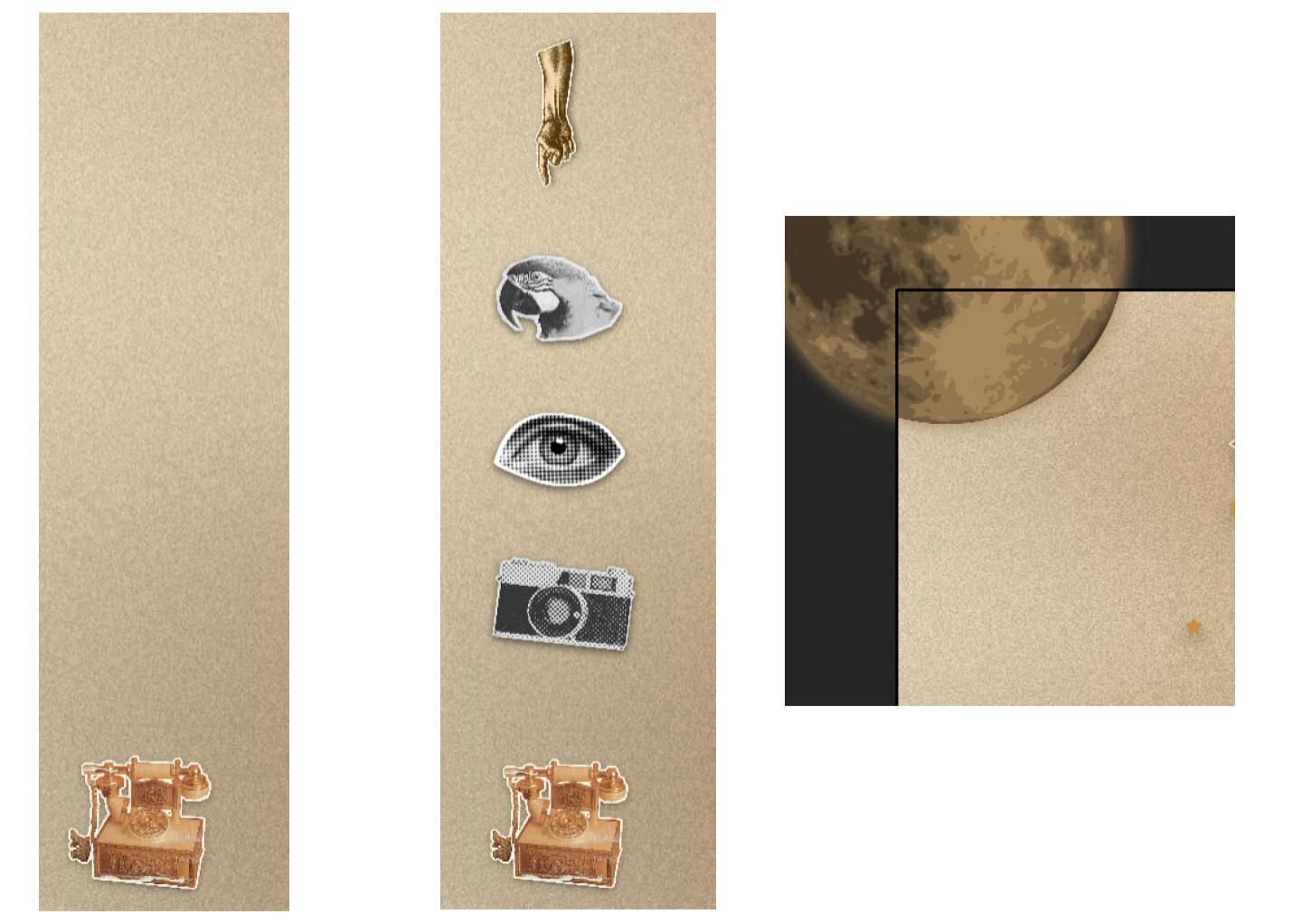
I created this Hamburger Social Media button on the side, when you click on the classic telephone (A representation for social media) the 4 images, Camera (Instagram), Eye (Email) & Bird (Twitter or X) slides up, alongside with the hand which acts as a close button for the hamburger. An addition to that, the moon in the corner spins and also acts as a home button.
Reflection
This project was a challenge due to the time constraints while juggling my other modules, but I overall liked the outcome. The challenges I faced like learning a new software were prominent as Adobe Animate uses keyframes and it got really confusing. I was able to develop more of my GSAP skills as I used things that I was not able to apply on other projects.A Few things to improve on are. being more aware of the format of visuals I am using because I believe that some of them were in PNG when it did not have to be, making the microsite very slow to load as the visuals files were big in size. Furthermore, I was not able to include a lot of micro-interactions as I did not have enough time, but I would include like moving on hover on the flowers of the NavBar, Submit button on the RSVP Page and the social media hamburger button.
Thank you for scrolling till the end <3